You know that specific feeling when you walk into a room and it just works? The colors sing, the light hits the corners right, and there's a sense of calm authority in the space. That's often the result of high contrast design. It's not about slapping black paint on every wall or painting everything white; it's about the dynamic tension between dark accents and crisp whites. This pairing creates a visual rhythm that feels both modern and grounded, avoiding the sterility of all-white rooms while steering clear of the cave-like heaviness of too much darkness.
I've seen this approach transform a cramped, windowless hallway into a dramatic entryway just by painting the trim a deep charcoal and leaving the walls stark white. It's a design strategy that relies on balance. When you get it right, the dark elements anchor the room, giving it weight and sophistication, while the white expanses keep the air moving and the space feeling open. It's less about following a rigid rulebook and more about understanding how light interacts with pigment in your specific environment.
Key Takeaways
- The 60-30-10 Rule: Use white for the bulk of the room (60%), dark accents for secondary elements like trim or furniture (30%), and a pop of color or texture for the remaining 10%.
- Lighting is Non-Negotiable: Dark colors absorb light, so you must layer your lighting to prevent the room from feeling gloomy or cave-like.
- Texture Adds Depth: Combine matte dark paints with glossy whites or metallic finishes to create visual interest without adding more color.
- Start Small: If you're hesitant, try a dark accent chair or painted trim before committing to full feature walls.
The Psychology of Contrast: Why It Feels So Good
Why does this combination work so well? It comes down to how our eyes process information. When you have a room filled entirely with mid-tones, the eye has nowhere to rest; it scans endlessly without finding a focal point. High contrast creates a visual hierarchy. The dark elements act as anchors, telling your brain where to look first, while the white spaces provide the negative space that lets the design breathe.
From a spatial perception standpoint, this is a powerful tool. White reflects light, effectively bouncing it around the room and making ceilings feel higher and walls feel further apart. Dark colors, conversely, absorb light and recede visually. By placing dark accents in specific zones—like behind a sofa or on cabinetry—you create depth. It tricks the eye into seeing dimension where there might only be flat planes.
Pro Tip: The 20% Rule
If you're worried about making a room feel too dark, stick to the 20% rule. Let white dominate about 80% of the visual field (walls, large furniture, floors). Use your dark accent for only about 20% of the surface area, such as trim, an accent wall, or smaller furniture pieces.
Choosing Your Palette: Beyond Just Black and White
When people say "high contrast," they often jump straight to black and white. While that's a classic look, it can feel a bit cold if not handled with care. There are plenty of other dark hues that pair beautifully with crisp whites, adding warmth and personality without losing the dramatic effect.
1. The Neutral Deep Dives
Charcoal and graphite are excellent choices for those who want a sleek, modern look without the starkness of pure black. These tones have enough gray in them to soften the transition to white. They work exceptionally well in living rooms where you want a sophisticated backdrop for artwork or furniture. Think of it as a softer version of black—it still commands attention but feels more inviting.
2. Jewel Tones for Warmth
If your home leans towards traditional or eclectic styles, consider deep jewel tones. Forest green, navy blue, or even a rich burgundy can create a stunning contrast against white. These colors bring an organic warmth that black sometimes lacks. For instance, a deep emerald green accent wall behind a fireplace can make the room feel cozy and grounded, like a library in a historic estate.
3. The Power of Matte vs. Gloss
The finish you choose is just as important as the color itself. A matte dark paint absorbs light and feels velvety and soft, which helps hide imperfections on walls. On the other hand, glossy or semi-gloss whites reflect light brilliantly. Pairing a matte charcoal wall with gloss white trim creates a subtle play of light that highlights the architectural details. If you're looking to add a touch of luxury, consider metallic finishes like brushed brass or matte black hardware against white cabinetry.
Material Matters
Don't limit your contrast to paint. Dark wood furniture, such as walnut or mahogany, introduces a natural warmth that complements white walls beautifully. Similarly, metallic fixtures in black or brass can serve as the "dark accent" without requiring you to paint anything.
Room-by-Room: Where High Contrast Shines
While this technique can work anywhere, some rooms benefit from it more than others. Here is how to apply it effectively in different spaces.
Living Rooms: The Anchor Effect
The living room is the perfect candidate for high contrast because it's a social space where you want guests to relax but also feel impressed by the design. A dark accent wall behind the sofa creates an immediate focal point, drawing the eye and making the seating area feel like a distinct zone within the room. To keep it from feeling too heavy, pair this with white or light gray curtains that let in plenty of natural light. If you are looking to refine your window treatments further, checking out guides on choosing the right colors can give you ideas on how to coordinate wall paint with window coverings for a cohesive look.
Kitchens: Depth in Open Plans
In modern kitchens, especially open-plan ones, high contrast is a game-changer. Dark cabinetry paired with white countertops and backsplashes creates a striking visual separation between the cooking area and the rest of the room. This not only adds depth but also makes the space feel more intentional and less cluttered. Since kitchens are functional spaces, you need to ensure the dark elements don't show every smudge or fingerprint. If you have a small kitchen, consider optimizing your storage with similar dark-and-light contrasts to maintain that sense of spaciousness.
Bathrooms: The Spa Atmosphere
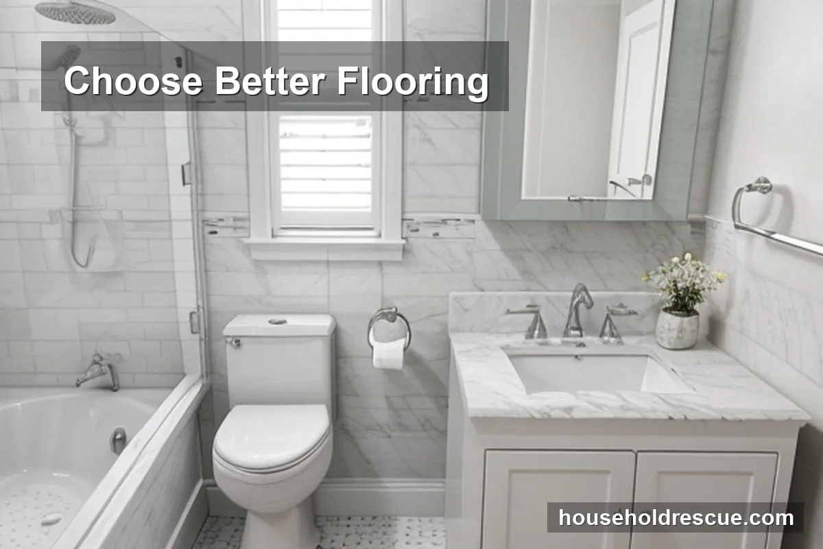
Dark tiles or fixtures in a white-dominated bathroom can instantly elevate the space to a luxury spa feel. This is particularly effective in larger bathrooms where the interplay of light and dark creates a sense of balance. However, be careful with small powder rooms; too much dark tile can make them feel claustrophobic. If you are redesigning your bathroom, ensure you have a functional layout that maximizes light before committing to a dark color scheme.
The Lighting Factor: Your Best Friend (or Worst Enemy)
This cannot be overstated: lighting is the make-or-break factor for high contrast design. Dark colors absorb light, which means they require significantly more illumination than light colors to feel inviting. If you rely solely on a single overhead fixture in a room with dark walls, it will likely feel like a cave.
You need a layered lighting approach:
- Ambient Lighting: General lighting that illuminates the whole room. In high-contrast rooms, this needs to be brighter than usual.
- Task Lighting: Lamps or under-cabinet lights that focus on specific activities like reading or cooking.
- Accent Lighting: Spotlights or wall sconces that highlight the dark features or artwork, creating drama and depth.
Warning: The Cold Factor
Never use dark colors in a room with poor natural light or low artificial lighting. Without enough light to bounce off the white surfaces, the dark accents will absorb what little light is available, making the space feel cramped, cold, and uninviting. Always assess your lighting situation before painting.
Common Pitfalls: What to Avoid
Even with a solid plan, it's easy to make mistakes that ruin the effect. Here are the most common errors I see homeowners make when attempting high contrast.
1. The "Turtle" Effect
This happens when you paint the walls dark but keep the trim white, creating a stark line that makes the room feel like a turtle shell. To avoid this, consider painting the trim in the same dark color as the wall for a seamless, expansive look, or use a slightly lighter shade of the dark color for the trim to soften the transition.
2. Ignoring the Floor
The floor plays a huge role in grounding the room. If you have dark walls and white furniture but a black floor, the room might feel like it's sinking. Try to keep the floor tone neutral or slightly lighter than the darkest wall color to maintain visual flow.
3. Clashing Textures
While mixing textures is good, mixing too many different finishes can look chaotic. Stick to a cohesive palette of materials—perhaps matte paint, gloss trim, and natural wood accents—to keep the focus on the contrast rather than the clutter.
Adding Life: Textures, Patterns, and Greenery
High contrast can sometimes feel a bit rigid if it's just paint and walls. To make the space feel lived-in and warm, you need to introduce texture and organic elements.
1. Textures Break the Monotony
Incorporate woven rugs, velvet cushions, or wooden accents. These materials add a tactile element that softens the sharpness of the dark-and-white contrast. For example, a chunky knit throw on a white sofa against a charcoal wall adds immediate coziness.
2. Mirrors Reflect Light
Mirrors are essential in high-contrast rooms. They bounce light around and visually expand the space. Placing a large mirror opposite a window can double the natural light, making the dark accents feel less oppressive. If you're looking for more ways to brighten your home, strategic mirror placement is a great next step.
3. Bring Nature Inside
Plants are the perfect counterpoint to high contrast design. The green of a leafy plant against a dark wall or white background adds a pop of life and softens the geometric lines of the room. If you are planning to add more greenery, check out tips on indoor plant care to keep your botanical accents healthy and vibrant.
High Contrast Outdoors: Extending the Design
This design philosophy isn't limited to indoors. For outdoor areas like patios or decks, pairing dark furniture with white or light-colored flooring creates a chic, modern look that stands out against the natural environment. This approach is especially effective when combined with innovative patio and deck ideas that emphasize functionality and style.
For example, a dark metal pergola against white outdoor cushions creates a striking silhouette. It's also worth considering the maintenance aspect; dark furniture can get hot in direct sunlight, so choose materials that reflect heat or provide shade. If you have any outdoor structures that need upkeep, remember to check out roof and gutter care tips to keep your home's exterior in top shape.
Frequently Asked Questions
1. Can high contrast work in small rooms?
Yes, but you must be strategic about placement. Use dark accents sparingly—like on a single accent wall or furniture—to create a focal point without overwhelming the space. Ensure you have ample lighting to prevent the room from feeling smaller.
2. What are the best dark colors to pair with white?
Charcoal, navy blue, forest green, and deep burgundy are excellent choices. These colors add depth and warmth without clashing with the brightness of white surfaces.
3. How do I avoid a high-contrast room feeling too cold?
Incorporate warm textures like wool, velvet, or natural wood to soften the starkness. Adding warm lighting, such as lamps with amber bulbs, can also create a cozy atmosphere that counters the cool tones.
4. Is high contrast suitable for all home styles?
It works exceptionally well in modern, Scandinavian, and industrial styles. However, it can be adapted for traditional spaces by using softer dark hues like olive green or navy and incorporating classic textures like brass and wood.
5. Can I use high contrast in a bathroom?
Absolutely. Dark tiles or fixtures in a white bathroom can create a luxurious, spa-like feel. Just ensure you have proper lighting to maintain a welcoming ambiance and avoid making the space feel like a cave.
6. How do I maintain a high-contrast room?
Regular cleaning of dark surfaces is essential to prevent dust buildup, which can make them look gray over time. Choose easy-to-clean materials for dark accents, and avoid using harsh chemicals that can damage finishes.
Final Thoughts: Embrace the Contrast
High contrast room colors offer a timeless, elegant solution for modern interiors. By carefully selecting dark accents and balancing them with crisp whites, you can create a space that feels both stylish and comfortable. The key is to understand your lighting conditions and not be afraid to experiment with different textures and materials. For further inspiration, explore small home laundry spaces or kitchen maintenance tips to complement your high-contrast scheme.
Remember, the goal isn't perfection; it's creating a space that feels right for you. Start small—maybe with a dark accent chair or a statement piece of art in a white room—and gradually expand the scheme as you get comfortable with the look.
Final Tip: The Test Drive
Before painting an entire wall, test your colors on large poster boards. Observe them at different times of the day to see how the light changes the contrast. This simple step can save you from costly mistakes and ensure the final look is exactly what you envisioned.
Disclaimer: The information provided in this article is for general informational purposes only and does not constitute professional interior design advice. Always consult with a qualified professional for specific design needs, structural changes, or safety-related modifications to your home.
Sources & References
- Interior Design: The Psychology of Color — American Psychological Association